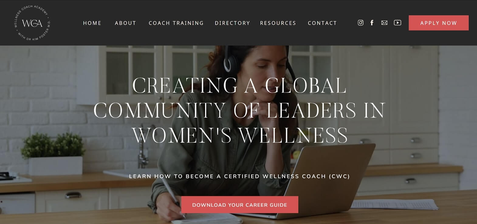
1. Wellness Coach Academy
Use of Live Imagery: The incorporation of moving images, such as background videos or animated graphics, creates a dynamic and engaging user experience. These live elements capture attention and convey energy, making the site feel immersive and inviting. This approach helps foster a connection between users and the brand’s mission of transformation.
Bright Call to Action Buttons: The bright coral call-to-action (CTA) buttons contrast sharply with the muted olive and black tones of the website, effectively directing user attention. This strategic color choice not only makes the CTAs eye-catching but also encourages engagement, leading users to take desired actions like enrolling in programs or signing up for newsletters.
Feminine Fonts and Imagery: The use of feminine fonts like Cormorant Garamond, along with soft imagery, caters specifically to a female audience interested in wellness coaching. These elegant fonts and visuals create a sophisticated yet approachable tone, helping to resonate with the target demographic. This thoughtful design fosters an emotional connection, enhancing user loyalty and encouraging community building.
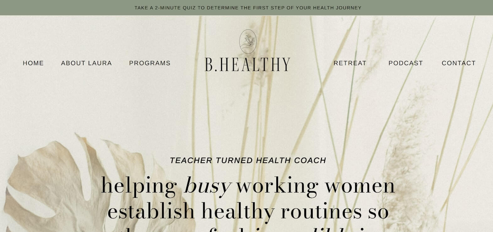
2. B.Healthy
Natural Imagery and Colours: The use of natural imagery and a nature-inspired color palette creates a calming atmosphere that reinforces the site’s focus on holistic wellness. Soft earth tones and vibrant greens evoke tranquility, making visitors feel welcome and aligned with the brand’s mission of promoting health and well-being.
Clean Black Outlines: Clean black outlines around text boxes and images add structure and clarity to the design. This minimalist approach ensures content is organized and easily digestible, enhancing readability and guiding users through the site without overwhelming them. It contributes to a professional appearance while improving navigation.
Quizzes and Free Resources: Interactive quizzes and free resources significantly engage users and add value to their experience. Quizzes help visitors assess their wellness knowledge, while free guides or e-books establish the academy as a thought leader. This approach encourages user interaction and builds relationships, nurturing leads for potential enrollment.
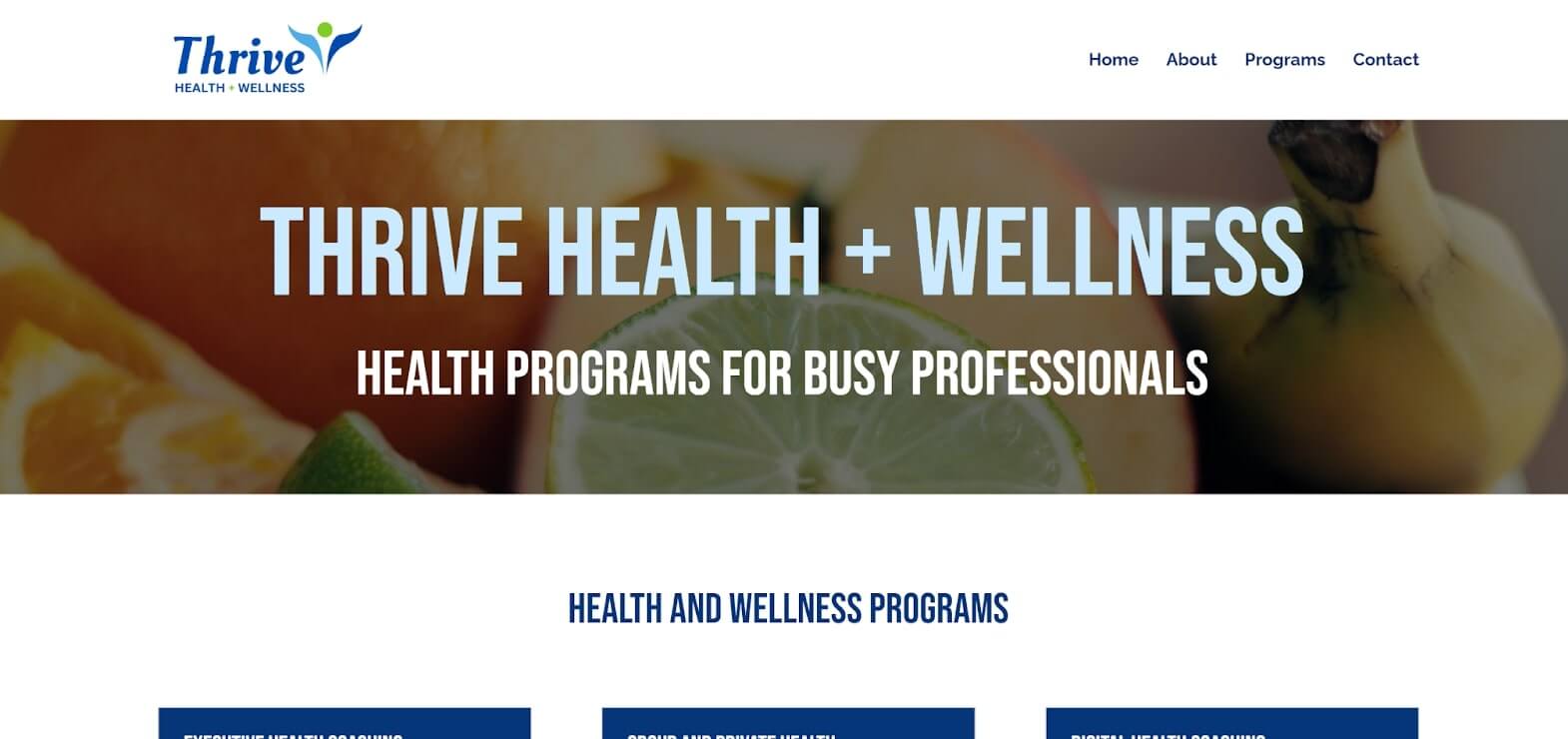
3. Thrive Health and Wellness
Moody Dark Tones: The use of dark grey and blue tones establishes a distinguished, professional look that aligns well with the expectations of an executive audience. This colour scheme, reminiscent of high-end law firms and consulting agencies, creates a feeling of sophistication and reliability. The moody, subdued tones communicate a sense of stability and discretion, subtly suggesting that the coach offers a premium service tailored to individuals who value privacy and professionalism in their wellness experiences.
Balanced Imagery with Ample White Space: Imagery is strategically placed throughout each page, surrounded by generous white space, which enhances readability and maintains user engagement. By avoiding overly dense layouts, the design feels open and refined, allowing users to focus on the information presented without feeling visually overwhelmed. The balanced use of imagery also draws attention to key content areas, like services and practitioner profiles, enhancing the site’s structure and making it easier for users to find relevant information.
Expandable Information Sections: Certain sections on the website feature expandable content, allowing users to click and reveal additional information as needed. This feature prevents information overload by keeping the initial view concise while giving users control over what they want to explore in more detail. The expandable content is particularly valuable for an executive audience that may prefer a streamlined experience where they can easily access only the information most pertinent to them. It also supports a clean design aesthetic, allowing the page to retain a minimalist appearance even with substantial content available.
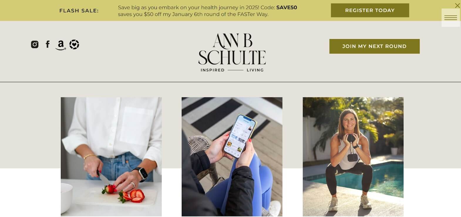
4. Ann B Schulte
Minimalist and Calm Aesthetic: The website’s design leans into minimalism, with ample white space, soft hues, and subtle typography that creates an inviting and peaceful atmosphere. This simplicity aligns perfectly with the coaching theme, fostering a calm environment for potential clients.
Personal and Trust-Building Content: Photos and client testimonials add an authentic, credible touch to the site, building a connection with visitors. Featuring real client stories and inviting photography makes the service feel genuine and personal
Soothing Color Palette:
- Muted Sage Green: Used in headings and accents, sage green conveys a sense of growth and balance, ideal for personal development.
- Light Beige and Cream Backgrounds: These warm neutrals provide a clean, welcoming backdrop that enhances readability while ensuring the design remains open and uncluttered.
5. Heartfelt Lotus Coaching
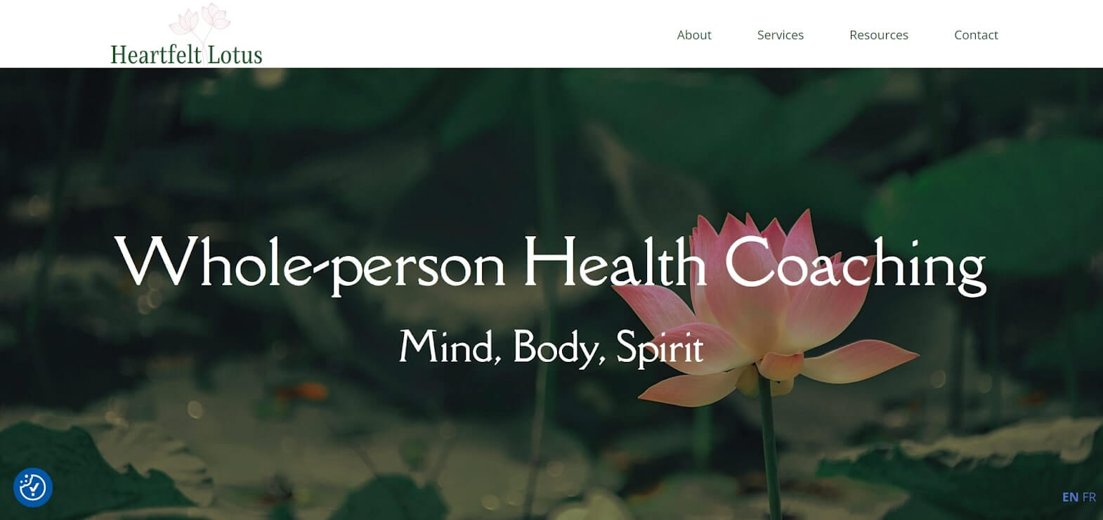
Soft and Therapeutic Color Palette: The website’s use of gentle pinks, earthy tones, and whites creates an inviting and safe atmosphere. This colour scheme is emotionally supportive and calming, which aligns perfectly with the goals of a coaching website focused on personal growth and healing. It invites users in without overwhelming them, establishing trust right from the first impression.
Lotus and Nature Imagery for Emotional Connection: Integrating lotus flowers and nature-inspired visuals throughout the site not only reinforces the brand’s identity but also symbolizes transformation and renewal – key themes in personal coaching. This imagery fosters a sense of peace and encourages visitors to feel open to change, effectively connecting the site’s visual elements with its coaching message.
Minimalist, Spacious Layout for Readability: By adopting a clean, open layout with ample white space, the website feels uncluttered and accessible, making it easy for visitors to read and navigate. Key information is separated into sections with collapsible details, so users can focus on what’s important without feeling overwhelmed by text. This design choice enhances the user experience, allowing visitors to explore at their own pace.
6. Run Well With Tay
Neutral Colour Palette
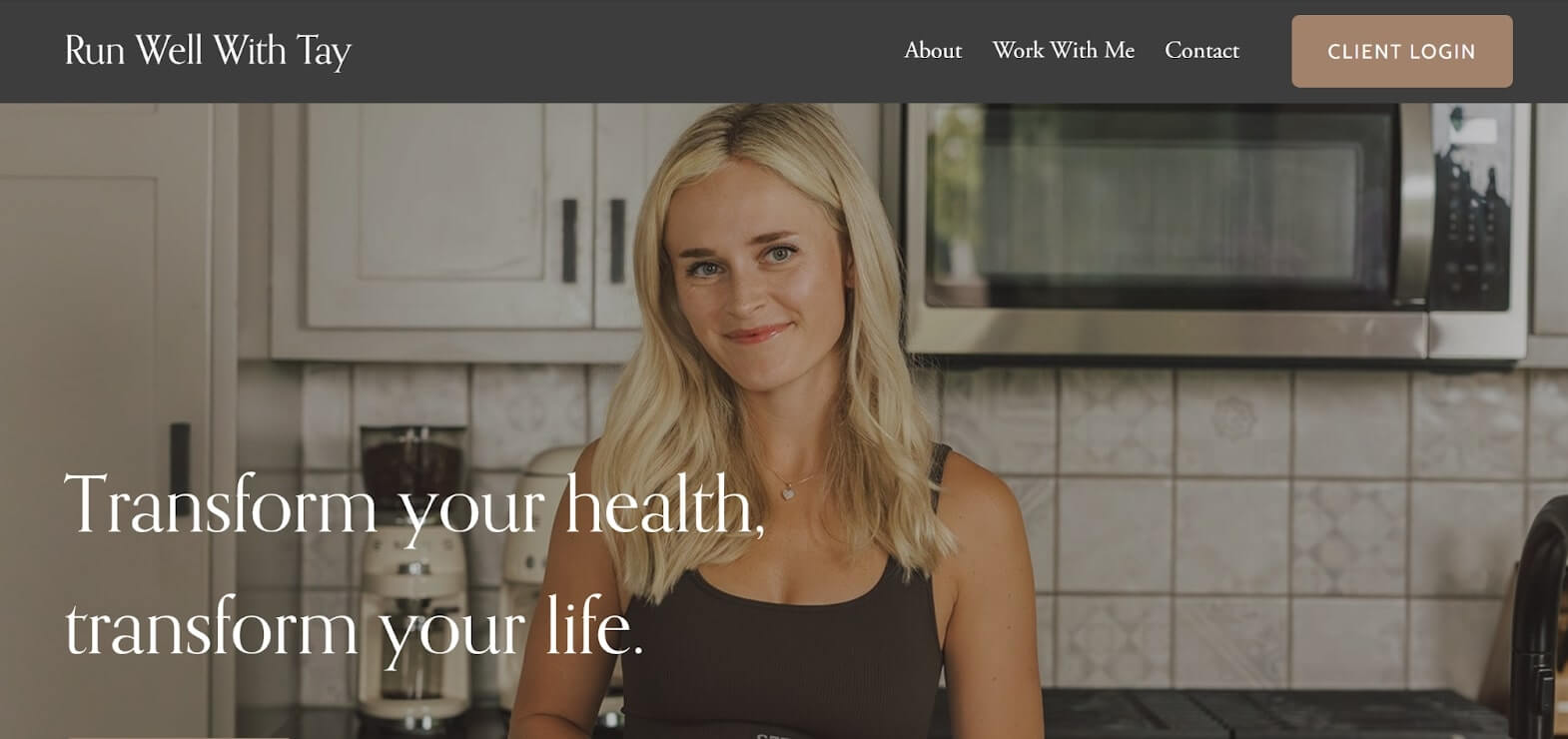
The website’s neutral colour palette, featuring shades of beige, soft whites, and muted grays, creates a calming and sophisticated atmosphere. This clean backdrop allows other elements to stand out while conveying professionalism and approachability. The tranquil tones align with the brand’s mission of promoting mental and emotional well-being.
Simple Minimalistic Layout
The simple, minimalistic layout enhances usability by reducing visual clutter and directing focus to key content. This design choice emphasizes essential elements like course offerings and testimonials, allowing users to navigate the site effortlessly. The modern, elegant look fosters a user-friendly experience that encourages exploration and engagement.
Professional High-End Photos of the Coach
High-quality photos of the coach elevate the website’s credibility and appeal. These images showcase the coach’s professionalism and create a personal connection with visitors. By featuring engaging and relatable settings, the photography conveys warmth and authenticity, building trust and encouraging potential clients to envision working with her on their wellness journey.
7. Nourish Your Life
Light Minimalist Design
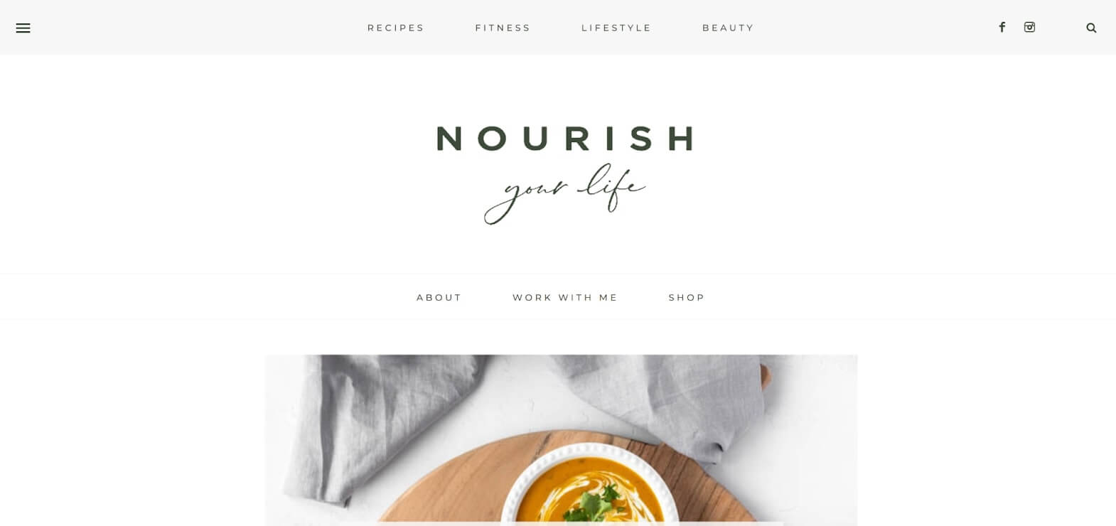
The light minimalist design of the website fosters an airy and spacious feel, promoting calm and clarity. By minimizing distractions and utilizing ample white space, the layout enhances readability and emphasizes key content, allowing users to navigate effortlessly. This modern aesthetic aligns with wellness themes, inviting visitors to explore the site at their own pace.
Clean Feminine Look
The clean feminine look appeals to the target audience by creating a warm and relatable atmosphere. Soft color palettes, gentle curves, and elegant typography foster connection and community among users. This thoughtful design choice enhances the overall experience and aligns with the brand’s mission of supporting women’s wellness journeys.
Bright Food-Focused Photography
Bright food-focused photography enhances the website by showcasing vibrant, fresh ingredients. High-quality images create an inviting visual experience, emphasizing the importance of nutrition in wellness. This appealing imagery reinforces the brand’s commitment to a balanced lifestyle and engages users by appealing to their senses.
8. Alexia DeGremont Health
Variety of Fonts for Interest
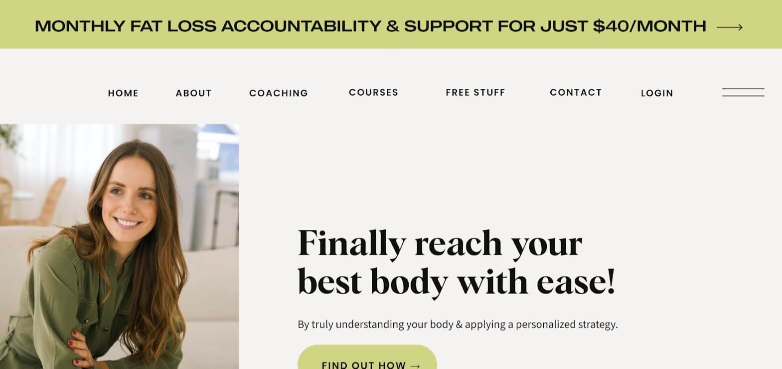
The use of varied fonts throughout the website adds visual interest and helps convey different tones. Combining serif and sans-serif fonts creates a dynamic aesthetic that enhances readability and engages users. Serif fonts may lend elegance to headings, while sans-serif fonts provide clarity for body text, breaking up content visually and reinforcing the brand identity.
Neutral Colours with Bright Green Accent
The neutral color palette of soft beiges, whites, and grays establishes a calming backdrop, while bright green accents inject vibrancy and energy. This strategic use of color highlights key elements, such as call-to-action buttons and headings, reflecting themes of growth and vitality while maintaining a balanced design.
Black Editorial Look
The black editorial look gives the website a polished and professional aesthetic, enhancing credibility. Bold headers and high-contrast text create a striking visual impact, helping to define sections and emphasize key messages. This style evokes authority, aligning with the brand’s mission to attract individuals seeking expert wellness coaching.
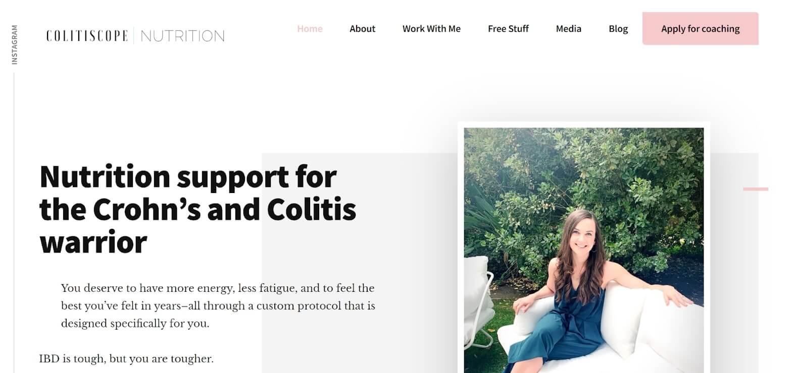
9. Colitiscope Nutrition
Geometric Blocking
Geometric blocking in the website’s layout adds structure and organization, creating a visually appealing design. By using distinct shapes like rectangles and circles, content is neatly segmented, guiding users through the site. This technique breaks up text, enhances information hierarchy, and contributes to a modern aesthetic that encourages exploration.
Testimonials Throughout
Incorporating testimonials throughout the site builds trust and credibility with potential clients. Strategically placed client feedback serves as social proof, showcasing real success stories that reassure prospective students. Visually distinct formats, such as quote boxes, draw attention to these endorsements, making them a prominent and engaging feature.
Readable Simple Fonts
The use of readable, simple fonts enhances user experience by ensuring clarity and legibility. Clean sans-serif fonts for body text create a modern feel, while bold headings establish a clear content hierarchy. This emphasis on straightforward typography accommodates diverse audiences and supports the brand’s mission of empowering individuals on their wellness journeys.
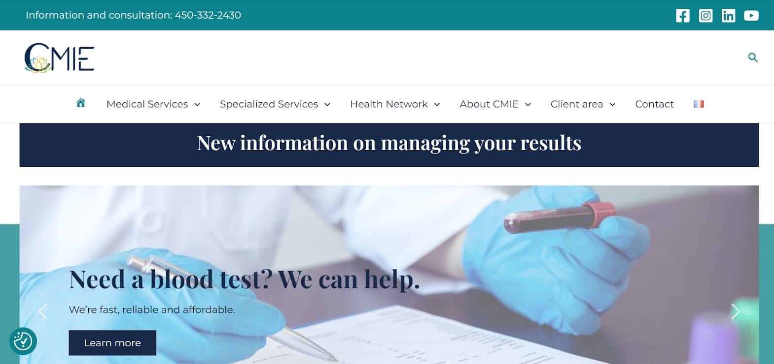
10. CMIE
Professional and Clean Layout: The website emphasizes a structured layout, with well-organized sections and a focus on readability. It avoids clutter, ensuring that important information about services, team, and contact details is easy to locate. This layout conveys trustworthiness and aligns with the expectations for a medical website.
Medical Blue Tones: The primary blue shades used throughout the site evoke calm and trust, creating an atmosphere that feels both secure and professional. Blue is commonly associated with healthcare as it reassures patients and symbolizes reliability.
Trust-Building Visuals: Professional images of medical staff and facilities add credibility to the clinic’s services. Team profiles and a contact section further build trust, reassuring users they are in capable hands.
Feeling Inspired?
Using other websites as inspiration is one of the first steps to creating a website that you love. If you see something you love that you would like to incorporate in your website, let’s book a call to chat about how we can grow your business to match your brand and gain more traction!
